
아이티 깃발 vs 리히텐슈타인 깃발
아이티 깃발과 리히텐슈타인 깃발을 나란히 비교하세요. 주요 차이점과 비슷해 보이는 이유를 알아보세요.
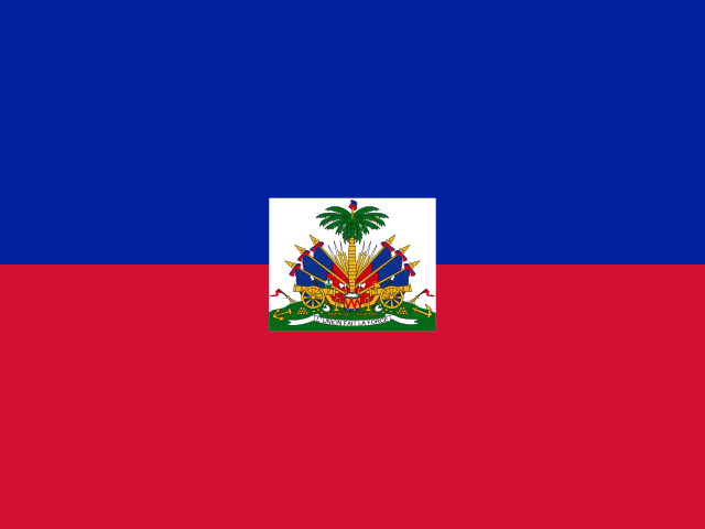
아이티
국기Horizontal bicolour of blue over red with the national arms at the center.
제정: 1803
비율: 2:3
색상: blue, red
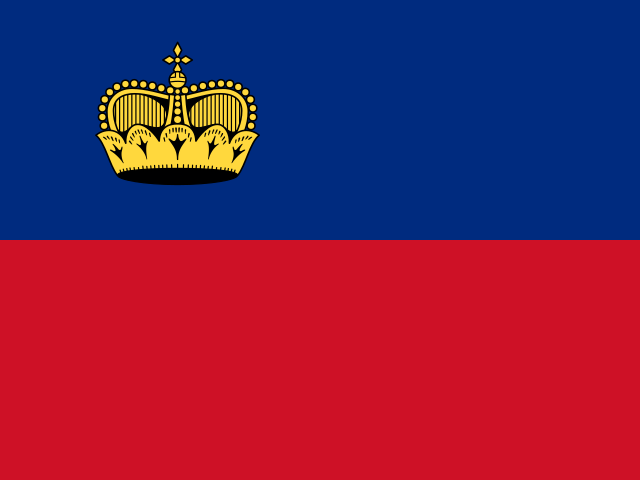
리히텐슈타인
국기Horizontal bicolour of blue over red with a princely crown at the upper hoist corner.
제정: 1921
비율: 2:3
색상: blue, red
주요 차이점
| 항목 | 아이티 | 리히텐슈타인 |
|---|---|---|
| Emblem | National coat of arms centered | Princely crown at the upper hoist corner |
| Adoption Year | 1803 | 1921 |
아이티와 리히텐슈타인 깃발은 왜 비슷할까요?
Both are plain blue-over-red horizontal bicolors — the rarest flag layout in the world, shared by only these two countries. The emblem position is the only reliable tell: centered arms versus a crown tucked in the hoist corner.